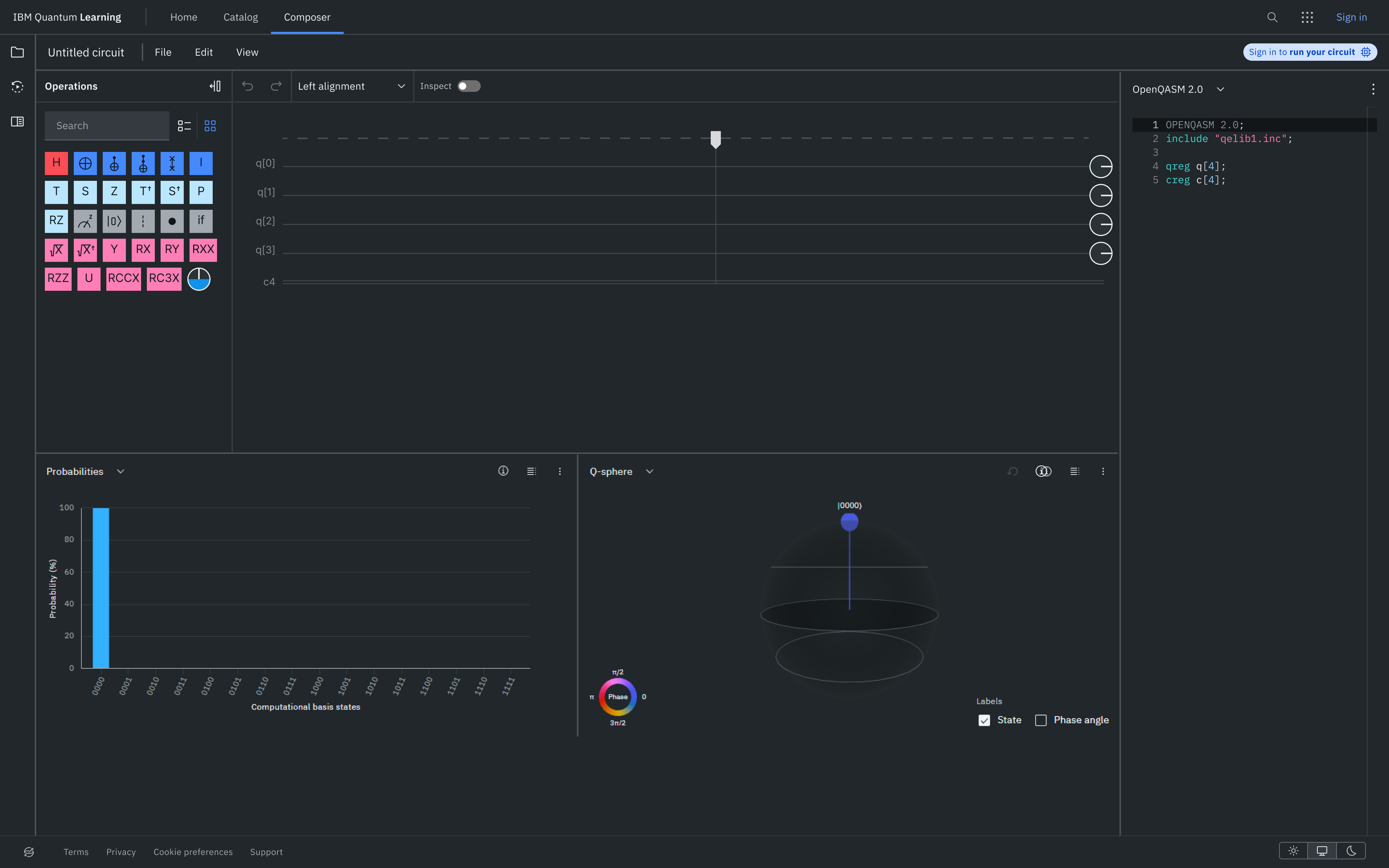
Redesigning IBM Quantum Composer to make quantum computing approachable for beginners — without limiting advanced users.
RoleUX research, UI/UX & interaction design
Duration2 months
TeamSolo project
ToolsFigma
Problem
IBM Quantum Composer tried to serve novices and experts with one interface — and neither group felt supported. Beginners were overwhelmed before they could start learning; experts were slowed down.
Solution
A dual-mode experience: a guided Basic Mode using progressive disclosure and in-context learning, an Advanced Mode with deeper control, and a community circuit catalogue connecting the two.
Impact
In NASA TLX testing, novices' mental demand dropped from 85 to 50 and frustration from 80 to 35, while performance satisfaction rose from 45 to 75 — with experts improving too.
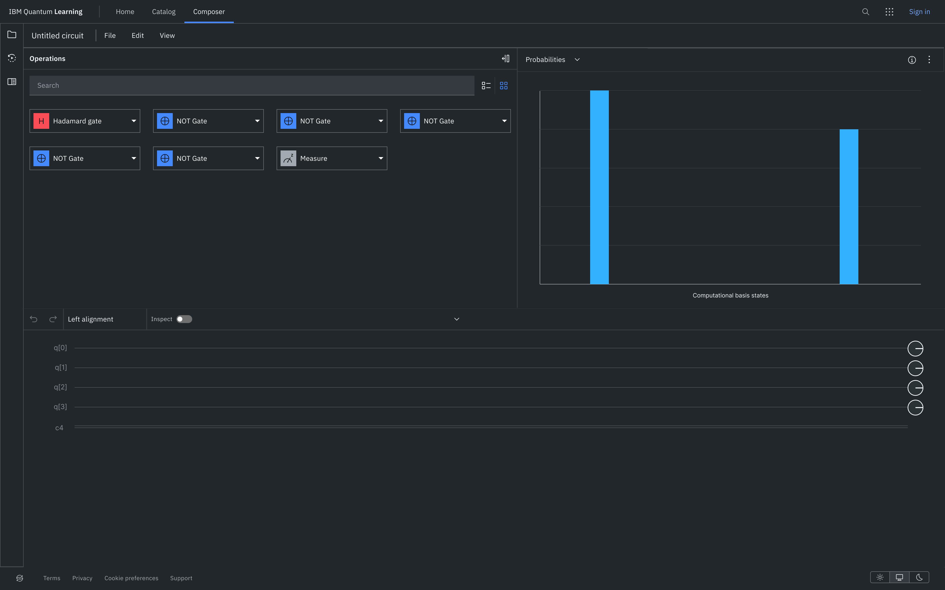
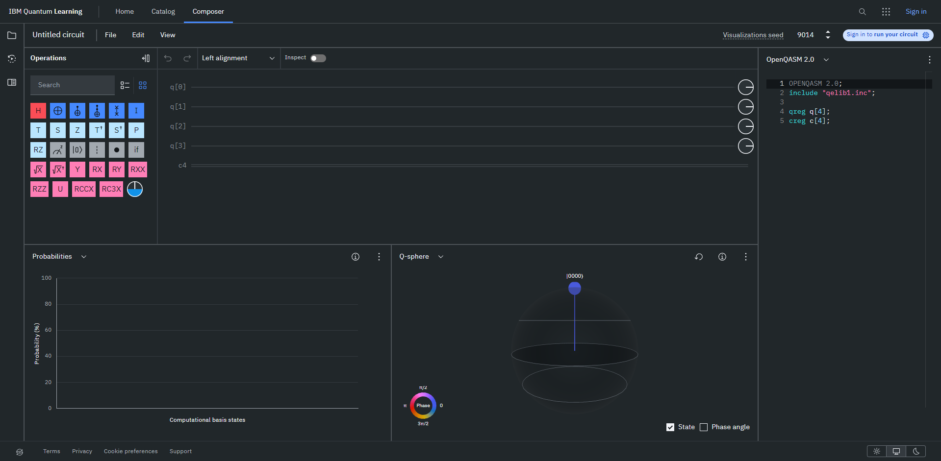
Before / After — drag the handle
◀ After — Basic ModeBefore — the interface novices faced ▶
01
The problem
Quantum computing platforms handle highly complex systems, but their interfaces are still difficult for new users to approach confidently. IBM Quantum Composer offered a visual way to build circuits, yet even simple tasks demanded high mental effort from beginners — while experienced users wanted more flexibility and control without slowing down. The challenge: balance simplicity for beginners with efficiency for experts, without oversimplifying the platform itself.
Cognitive overload
New users were immediately exposed to unfamiliar concepts, technical terminology and complex workflows, making the interface intimidating from the start.
Lack of guidance
Users struggled to understand how to begin building circuits, relying heavily on external tutorials to complete basic tasks.
Technical error feedback
Error messages were difficult for beginners to interpret — especially users without a programming background.
One interface for everyone
The same interface attempted to serve both novice and advanced users, but neither group felt fully supported.
02
Research & key insights
I ran heuristic evaluations, usability testing and think-aloud interviews with both beginner and experienced users. Quantum computing is a niche field, so the goal wasn't large amounts of data — it was understanding the behaviours, frustrations and mental models users brought to the interface.
01
Beginners felt overwhelmed before they could start learning
Novices struggled with unfamiliar terminology and overall complexity — even simple tasks required constant reference to external resources. Users often understood how to follow steps, but not why they were performing them.
02
Users wanted guidance built directly into the interface
Participants responded positively to contextual explanations and simplified workflows, preferring to learn by experimenting inside the platform rather than switching between external videos and documentation.
03
Advanced users valued flexibility over simplification
Experienced users knew the concepts but found the workflow inefficient. They wanted faster circuit inspection, more customisation, and clearer system feedback on complex tasks.
04
Error feedback created unnecessary frustration
Error messages were too technical and lacked actionable guidance, making troubleshooting difficult and raising frustration during even basic tasks.
"Beginners and experts were approaching the same interface with completely different mental models. That became the foundation of the redesign."
03
Design decisions
The redesign focused on reducing cognitive overload for beginners while giving experienced users the flexibility they needed. The goal was never to simplify quantum computing itself — it was to make learning it feel approachable instead of intimidating.
Decision 01
Separating beginner and advanced workflows
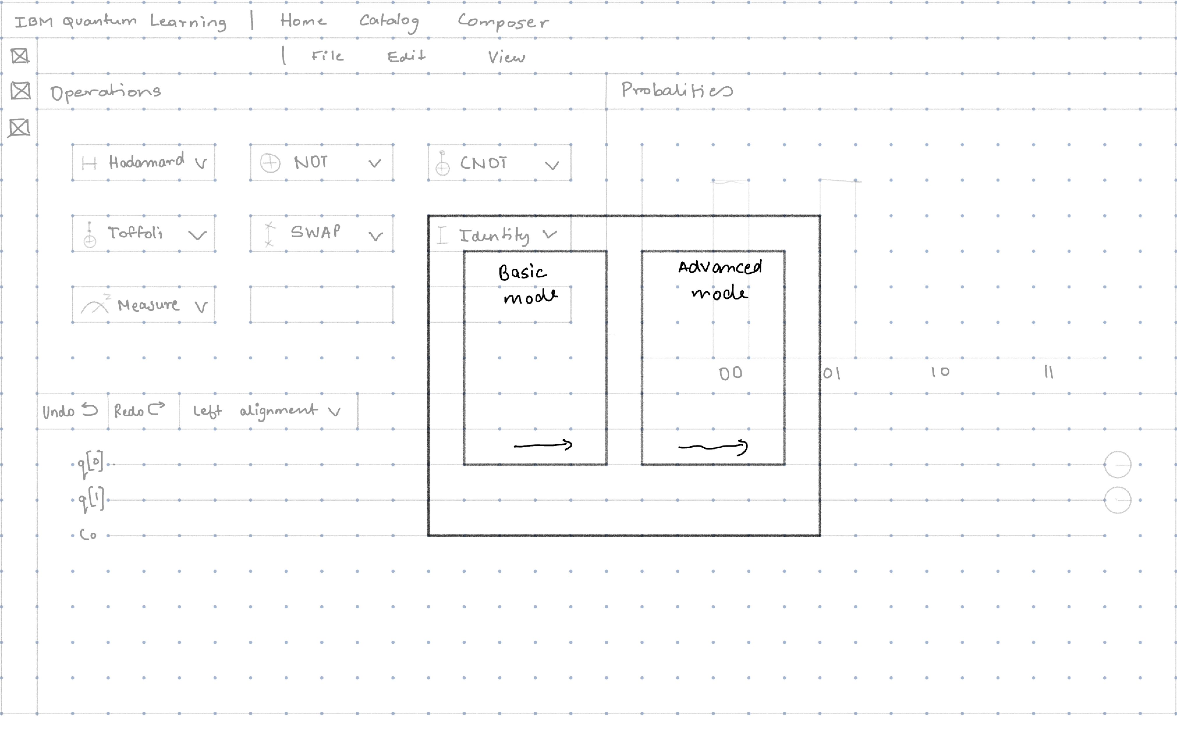
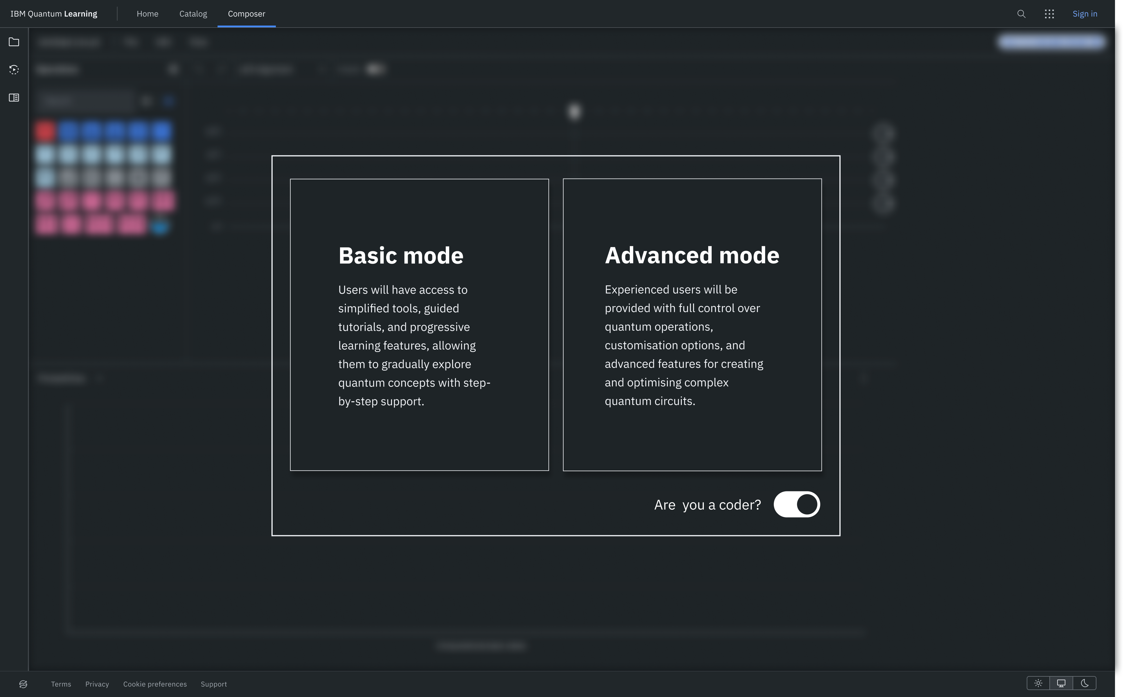
Testing showed one interface was trying to serve users with completely different levels of experience. The new onboarding introduces two paths — Basic Mode for beginners and Advanced Mode for experts — letting novices learn in a guided environment while experts get direct access to the tools they expect.
This reduced cognitive overload without limiting functionality.
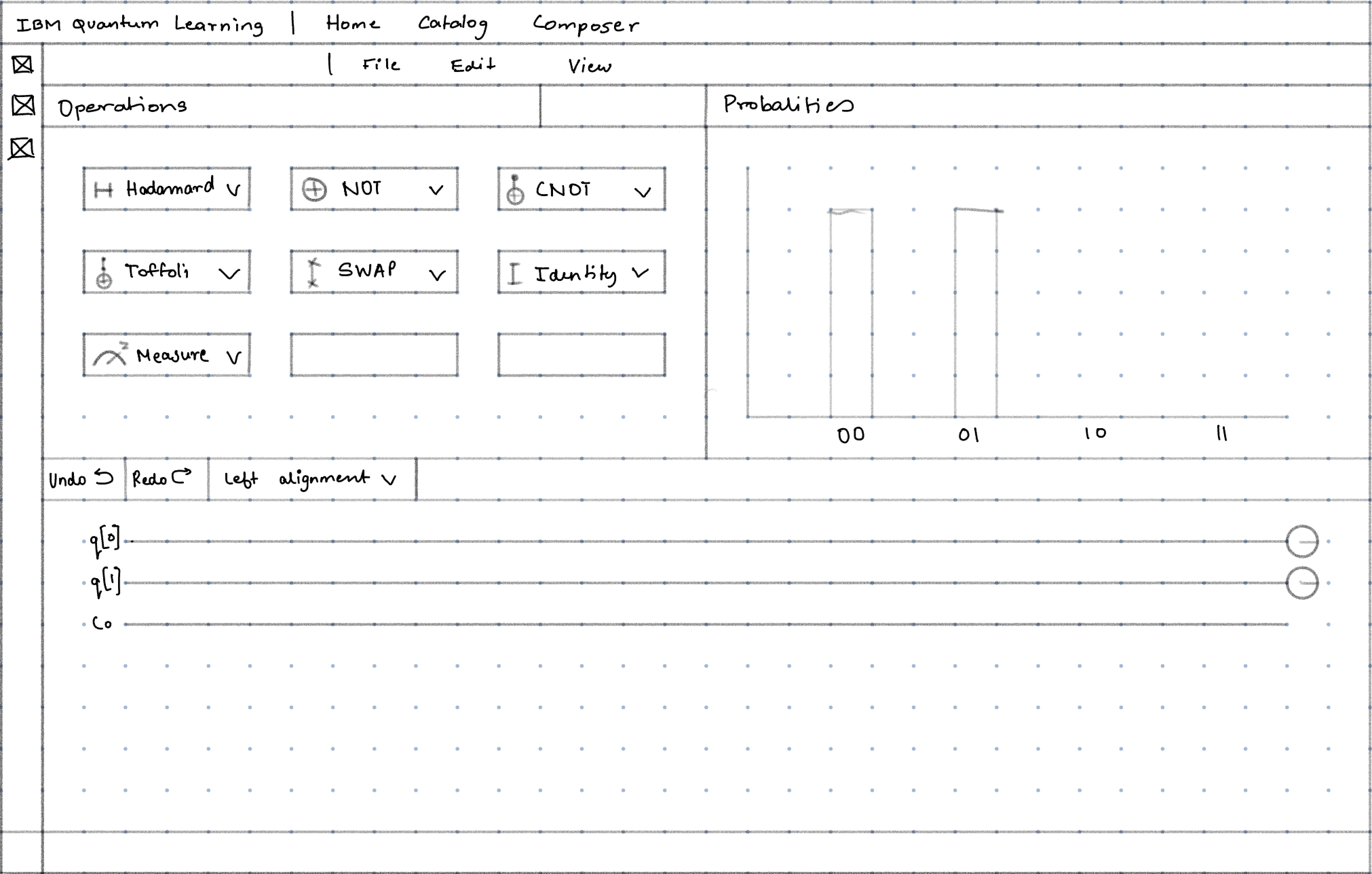
Low-fi sketch
Final onboarding
Decision 02
Progressive disclosure to reduce overwhelm
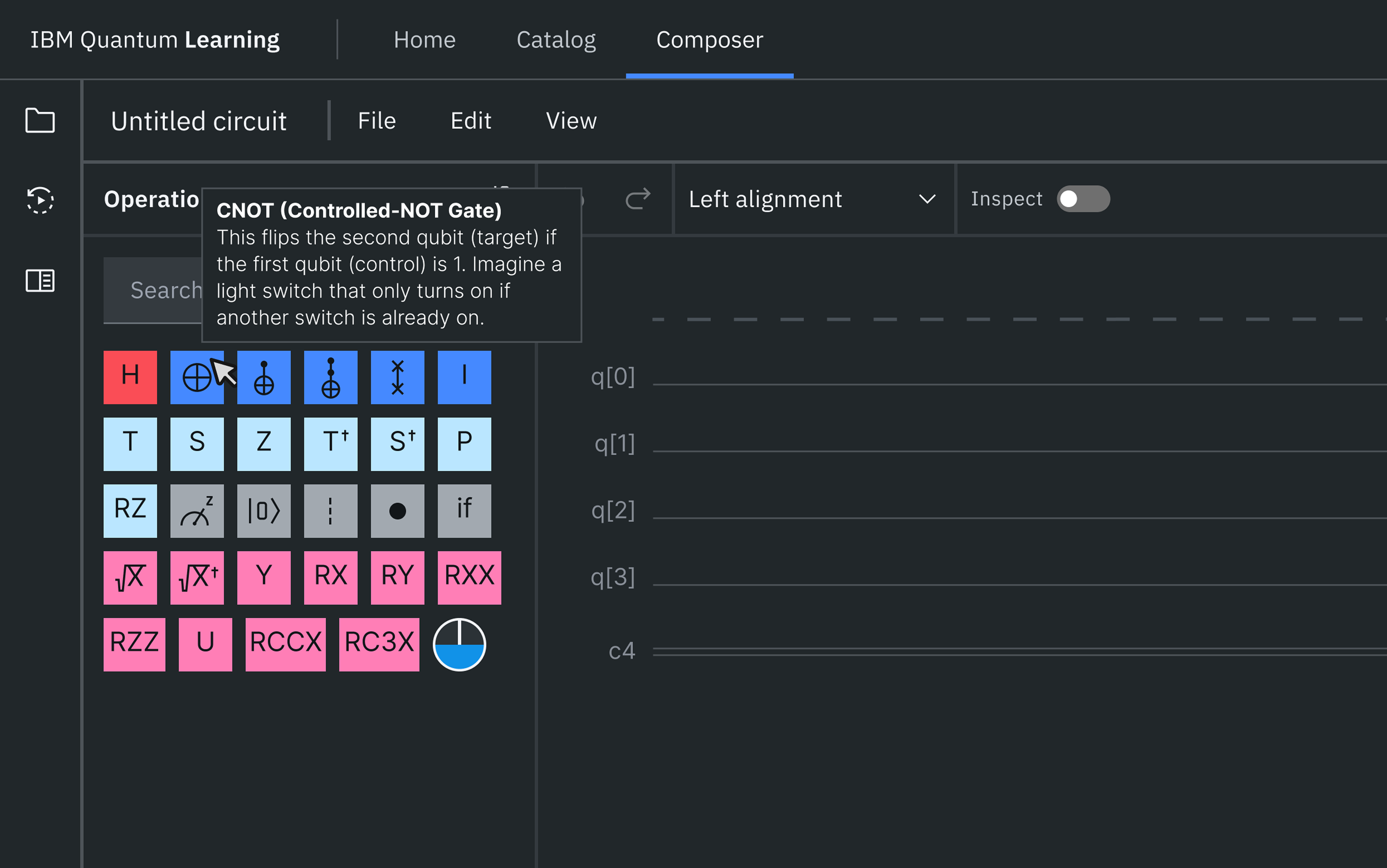
Instead of exposing every quantum gate upfront, Basic Mode initially shows only essential operations and reveals advanced functionality as users grow comfortable — helping them grasp core concepts before complex workflows.
The idea was inspired by how games introduce mechanics gradually rather than teaching everything at once.
Low-fi: essentials only
Final Basic Mode
Decision 03
Contextual learning inside the interface
Users leaned heavily on external tutorials. To break that dependency, explanations moved into the interface itself — hover states, tooltips, guided onboarding, and simplified gate descriptions — so users learn concepts while actively building circuits.
Decision 04
A community-driven catalogue
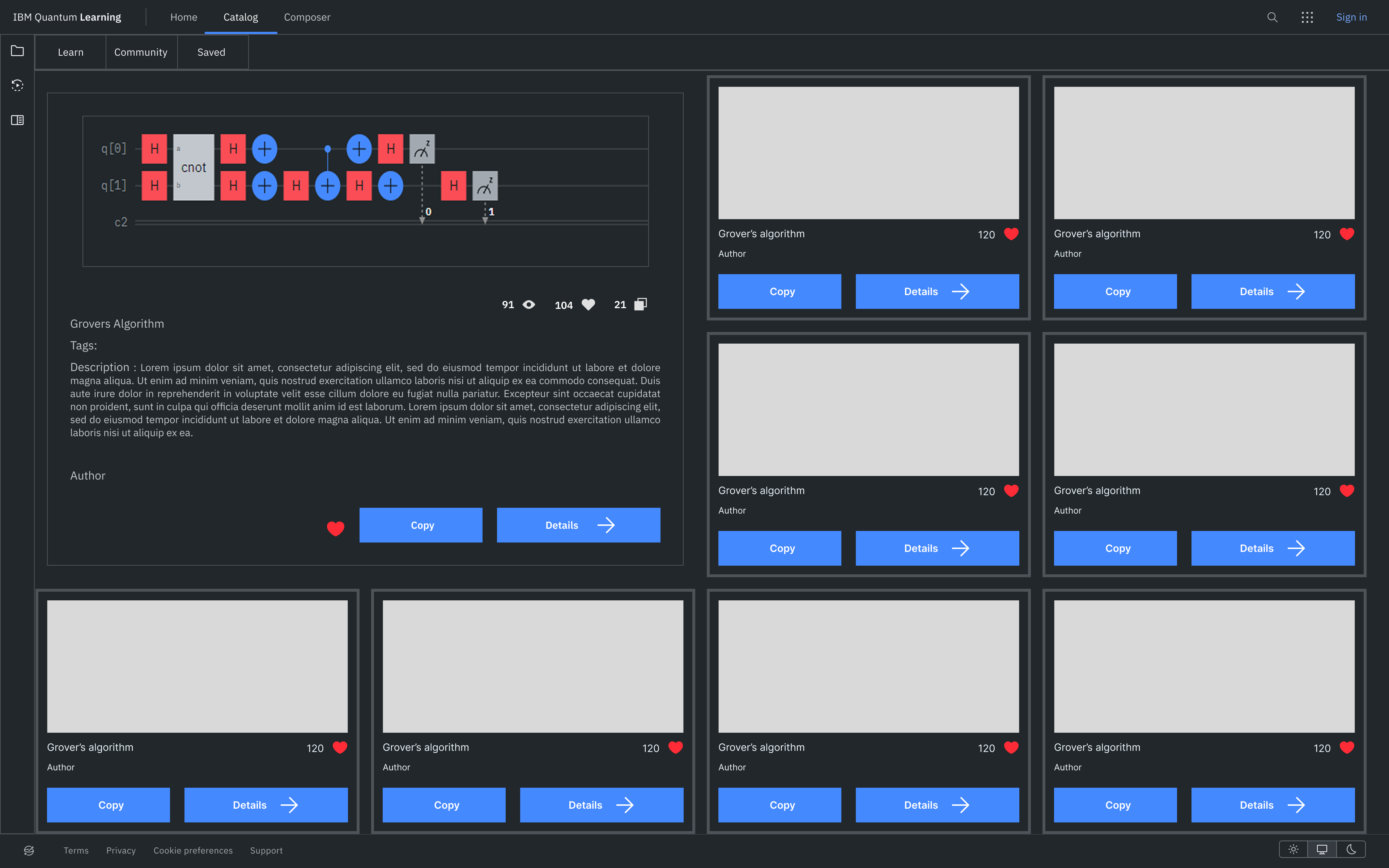
Users responded strongly to learning through existing examples. The redesigned catalogue creates an exploration-driven learning path:
Premade circuits
Guided algorithm breakdowns
Community uploads
Saved circuits
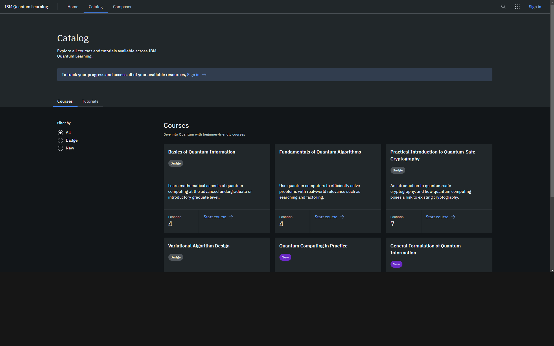
Before / After — drag the handle
◀ After — community circuitsBefore — courses only ▶
Decision 05
More flexibility for advanced users
While beginners needed simplification, experts wanted speed and control. Editable Qiskit/OpenQASM integration, advanced measurement controls and customisable workflows support technical users — without disrupting the beginner experience.
04
Outcomes
I validated the redesign with the same novice and expert users using NASA TLX, comparing workload scores against the original interface.
85 → 50Mental demand, novices
Experienced users improved from 70 to 55
80 → 35Frustration, novices
Experienced users dropped from 75 to 35
45 → 75Performance satisfaction, novices
Experienced users rose from 60 to 85
NovicesAppreciated the guided learning — onboarding and progressive disclosure made first circuits feel achievable rather than intimidating.
ExpertsValued the flexibility and customisation, and both groups praised the catalogue as a way to learn and collaborate.
05
Reflection
The biggest lesson: when one interface serves two audiences, the answer usually isn't a compromise in the middle — it's designing deliberately for each mental model and building bridges between them.
If I continued this work, I'd adapt the interface for mobile and tablet, explore integration with other quantum frameworks beyond Qiskit, and test AI-driven personalisation that adjusts how quickly advanced features are revealed to each learner.