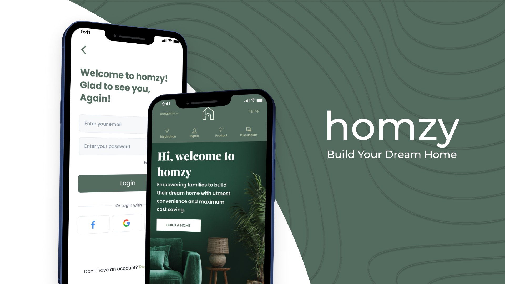
Most apps are designed for a user. Homzy is designed for a household — helping Indian families navigate the biggest, longest, most crowded decision of their lives: building a home from scratch.
RoleResearch, branding, UX/UI — solo
Duration2.5 months
Scope0 → 1 concept, mobile app
Research82 survey responses · 10 interviews
ToolsFigma
Problem
Building a house in India means coordinating architects, contractors, materials, budgets, Vaastu and — crucially — the whole family. That journey is scattered across word of mouth, YouTube and a dozen disconnected services.
Solution
One guided journey from inspiration to interior: matched professionals via a guided questionnaire, a materials and furniture marketplace, and community features that digitise the trust families currently find only through word of mouth.
Grounding
An 82-response survey and 10 user interviews revealed a multi-stakeholder decision process — 42% involved a spouse, 33% parents — that no competitor was designing for.
01
The problem
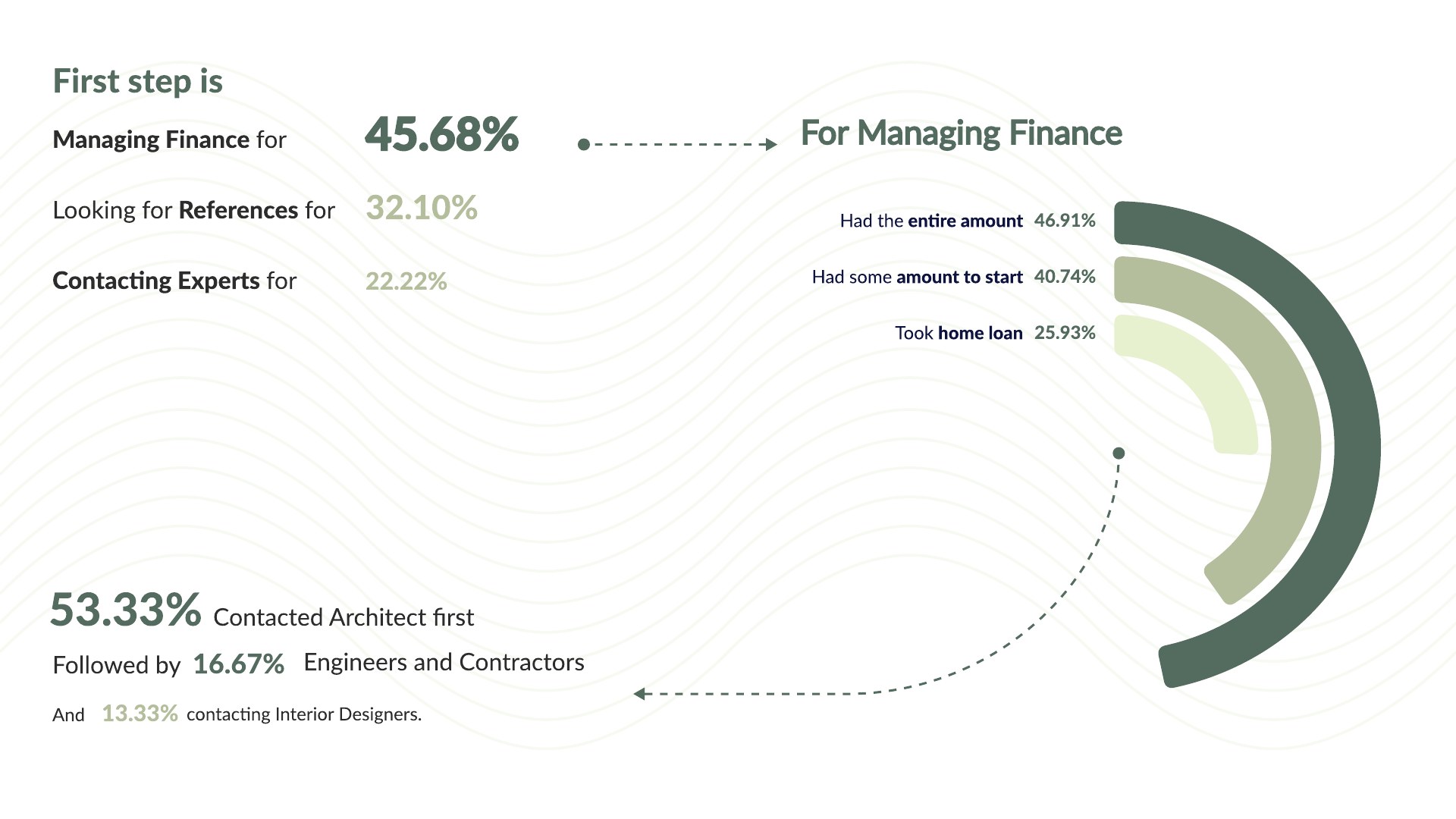
Post-Covid, Indian consumers moved decisively online for everything from groceries to furniture — but home construction stayed analogue, fragmented and stressful. First-time home builders don't know where to start (managing finance? finding references? contacting experts?), can't judge which professionals to trust, and coordinate the whole thing across a family where everyone has a say. The brief: bring the entire journey into one place.
02
Research & key insights
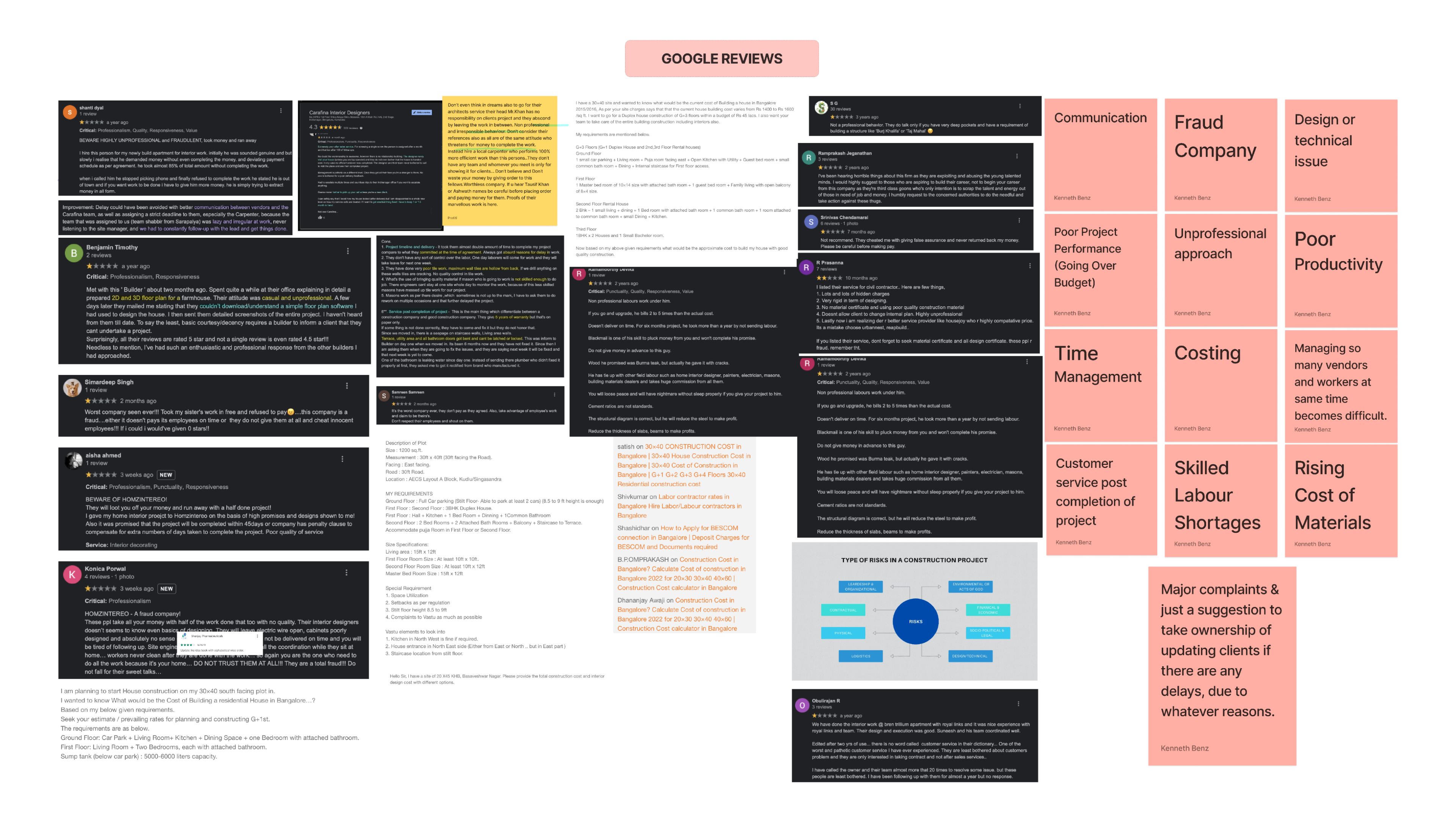
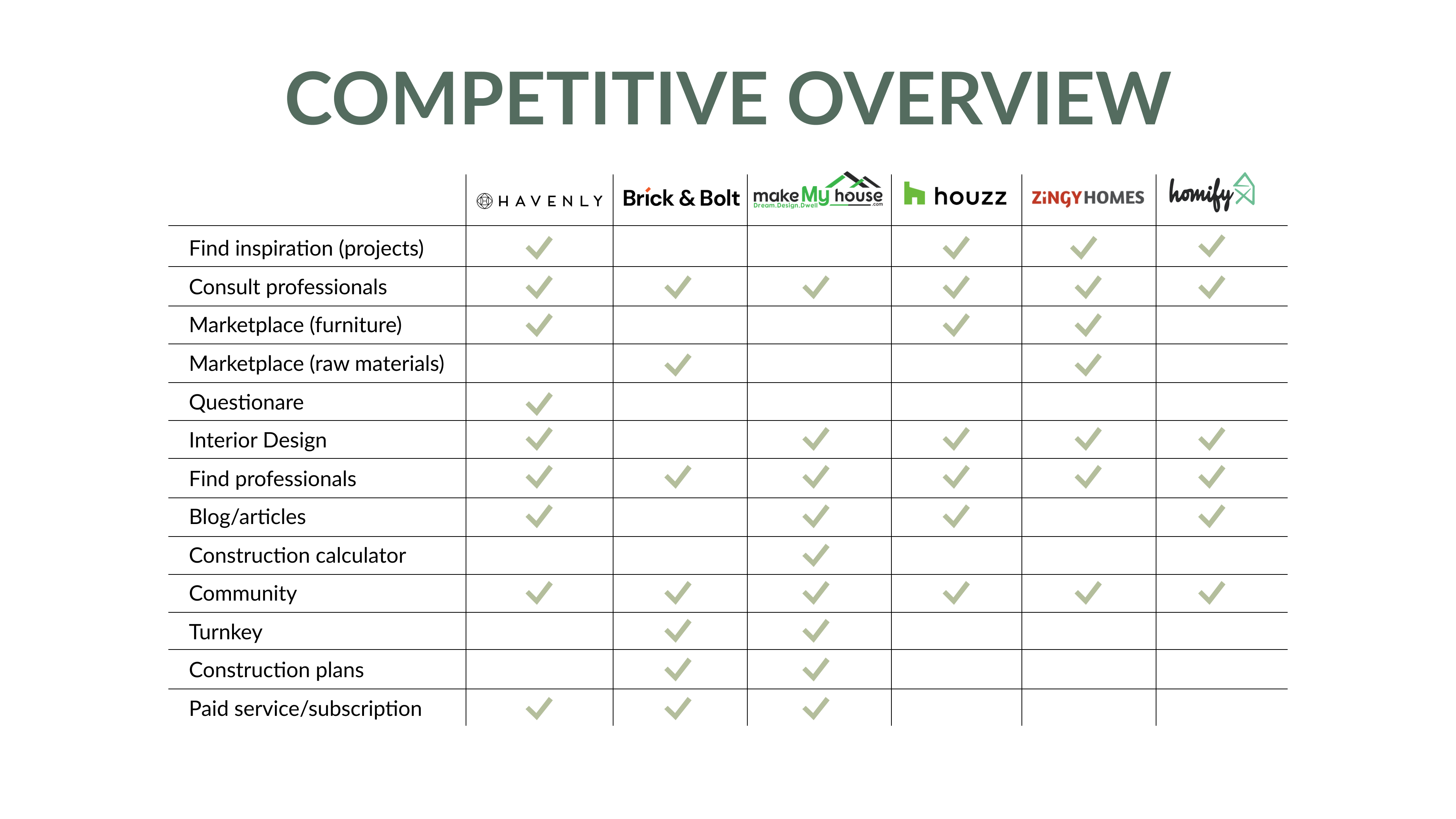
Research ran in three layers: secondary research mining hundreds of posts and reviews across Quora, Google Reviews, Facebook groups, the Play Store and Houzz forums — thematically coded into patterns like fraud, budget overruns and labour shortages; a competitive study of six platforms (Havenly, Brick&Bolt, MakeMyHouse, Houzz, ZingyHomes, Homify); and primary research with an 82-response survey plus 10 qualitative interviews. Three findings shaped everything that followed.
Review mining, thematically coded
Competitive feature matrix
01
The user is a household, not a person
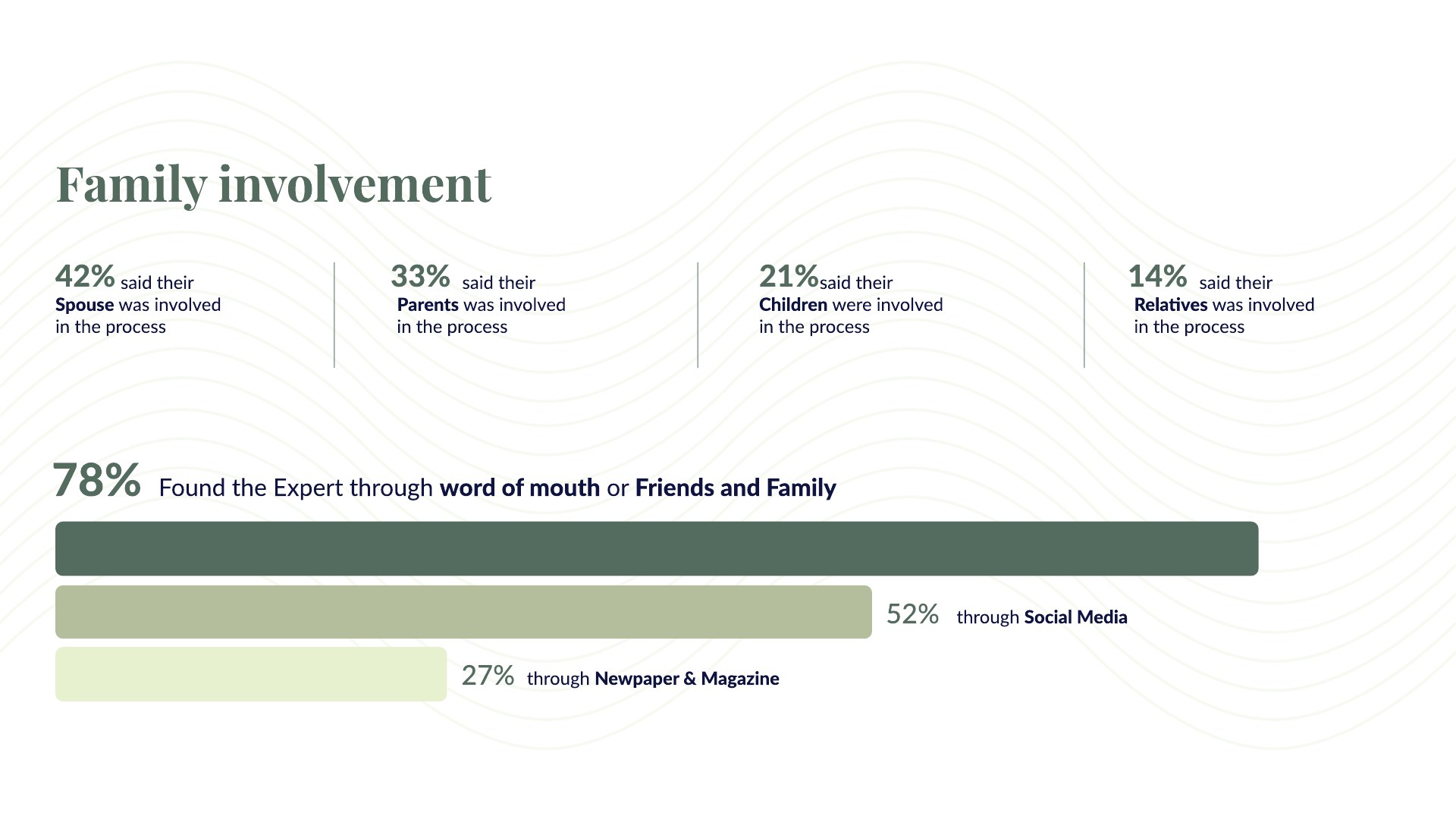
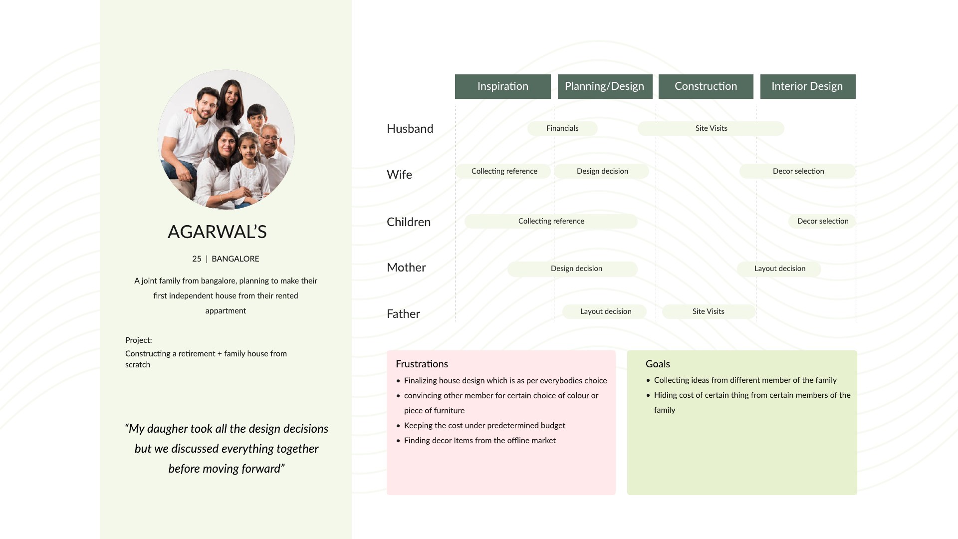
42% of respondents said their spouse was involved in the process, 33% their parents, 21% their children. Interviews confirmed it: decisions about layouts, finances and even paint colours were negotiated across generations. A family persona mapped who owned which decision — finance, design, approvals — through each stage.
02
Trust travels by word of mouth
78% found their expert through word of mouth or friends and family; 53% contacted an architect first and let that person assemble everything else. People weren't searching for professionals — they were searching for someone they could believe. Any app replacing that chain needed to carry its trust signals: testimonials, credentials, visible past work.
03
The journey starts long before the first brick
The most-cited first step was managing finance (46%), and the stages people most wanted involvement in were designing plans (79%) and interior design (67%). Inspiration flowed from YouTube (73%) and Google (63%) — and post-completion, families said finalising the design was the most time-consuming stage. The app had to serve inspiration, planning, construction and interiors as one continuum.
The household finding
Where the journey begins
A persona for a family, not a user — mapping who owns which decision at each stage
"Nobody builds a house alone in India. The design question wasn't 'what does the user need' — it was 'how does a family decide.'"
03
Design decisions
Decision 01
Match professionals by project, not by browsing
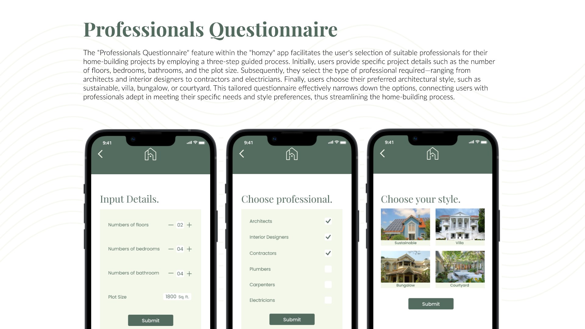
Because families trust recommendations over search, the professionals flow inverts the marketplace pattern: a three-step guided questionnaire captures the project (floors, bedrooms, plot size), the professional type needed, and the family's preferred architectural style — then recommends matched experts, each carrying the trust signals research demanded: credentials, portfolios, testimonials and ratings.
The guided matching flowDecision 02
One continuum from inspiration to interiors
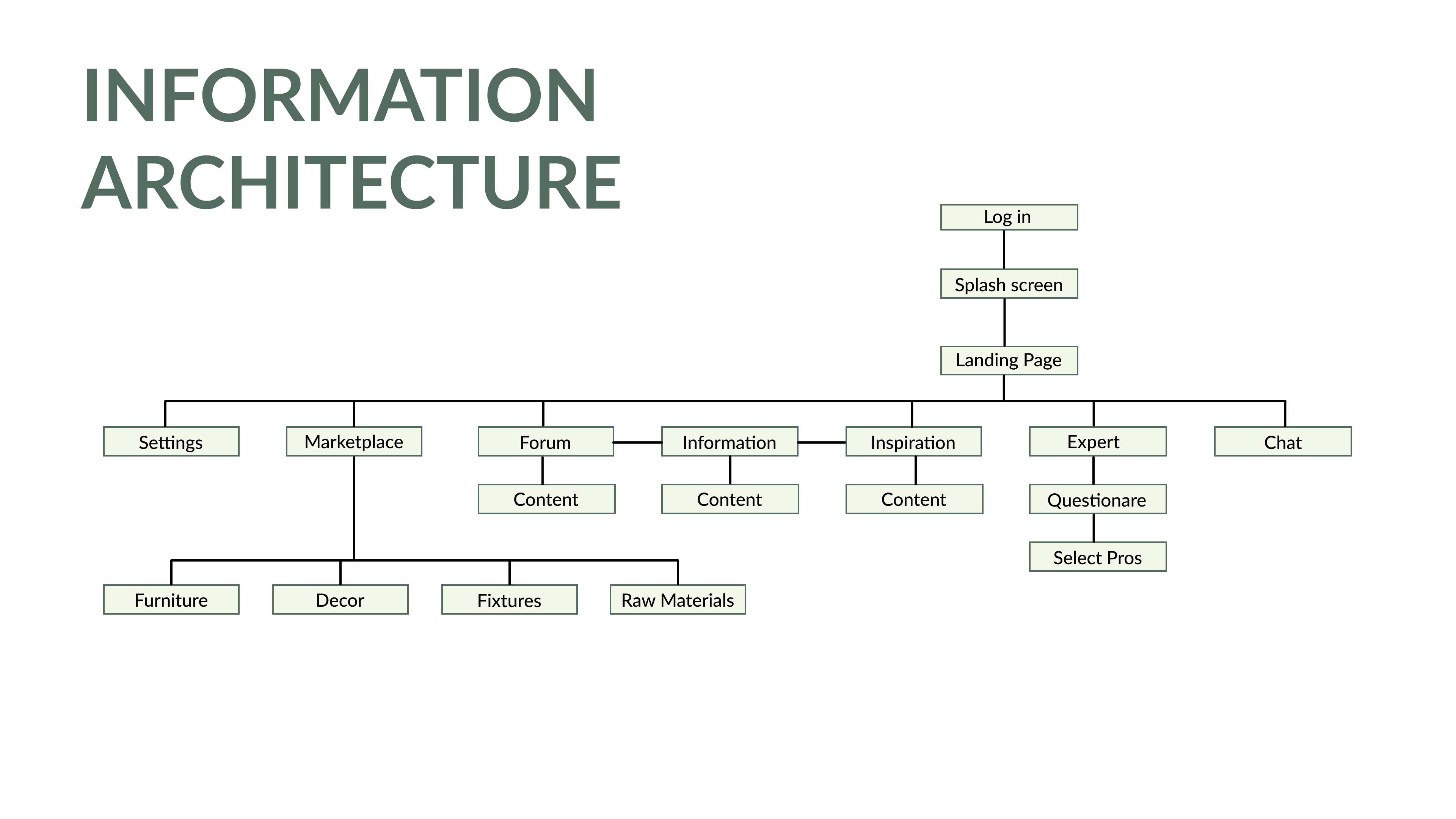
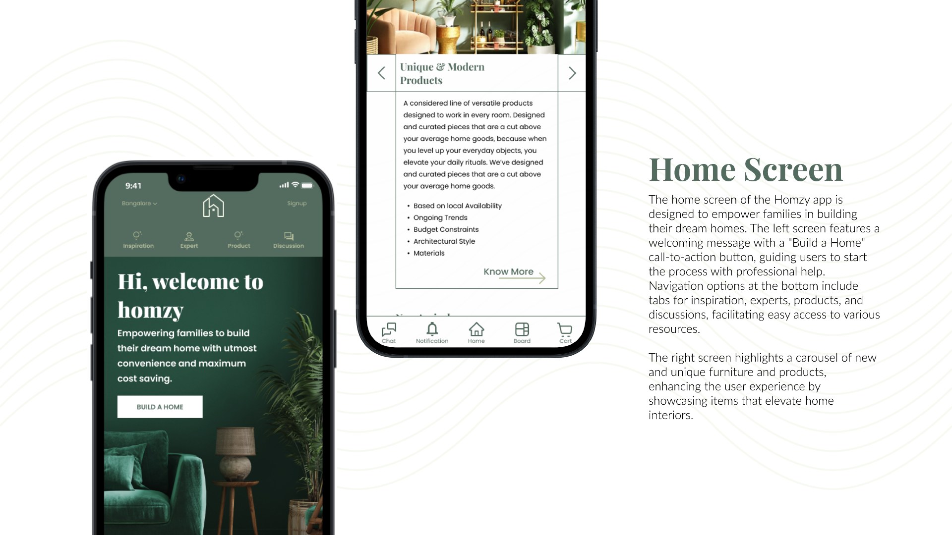
The IA organises the app around the stages families actually move through — inspiration, information, professionals, marketplace, community — rather than isolated features. The home screen leads with "Build a Home" as the primary action, with curated inspiration and discussion feeding the earlier, messier phases of the journey.
Information architecture
Home: one primary action
Decision 03
A marketplace that follows the build
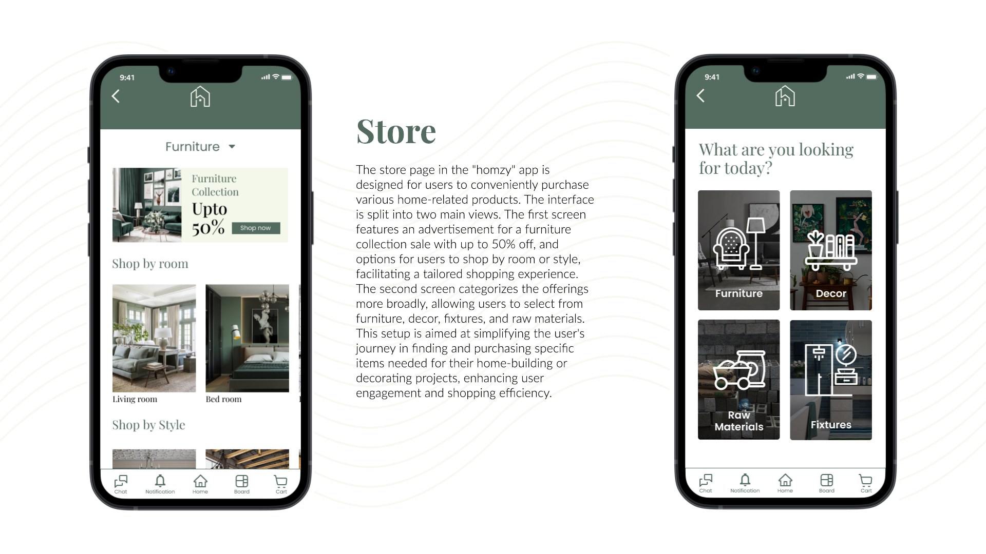
Because the journey continues past construction into fixtures and furniture — the stage families called most frustrating — the store organises by room and by style, spanning furniture, décor and raw materials, so the same app that found your architect furnishes your living room.
Store: shop by room, style, material
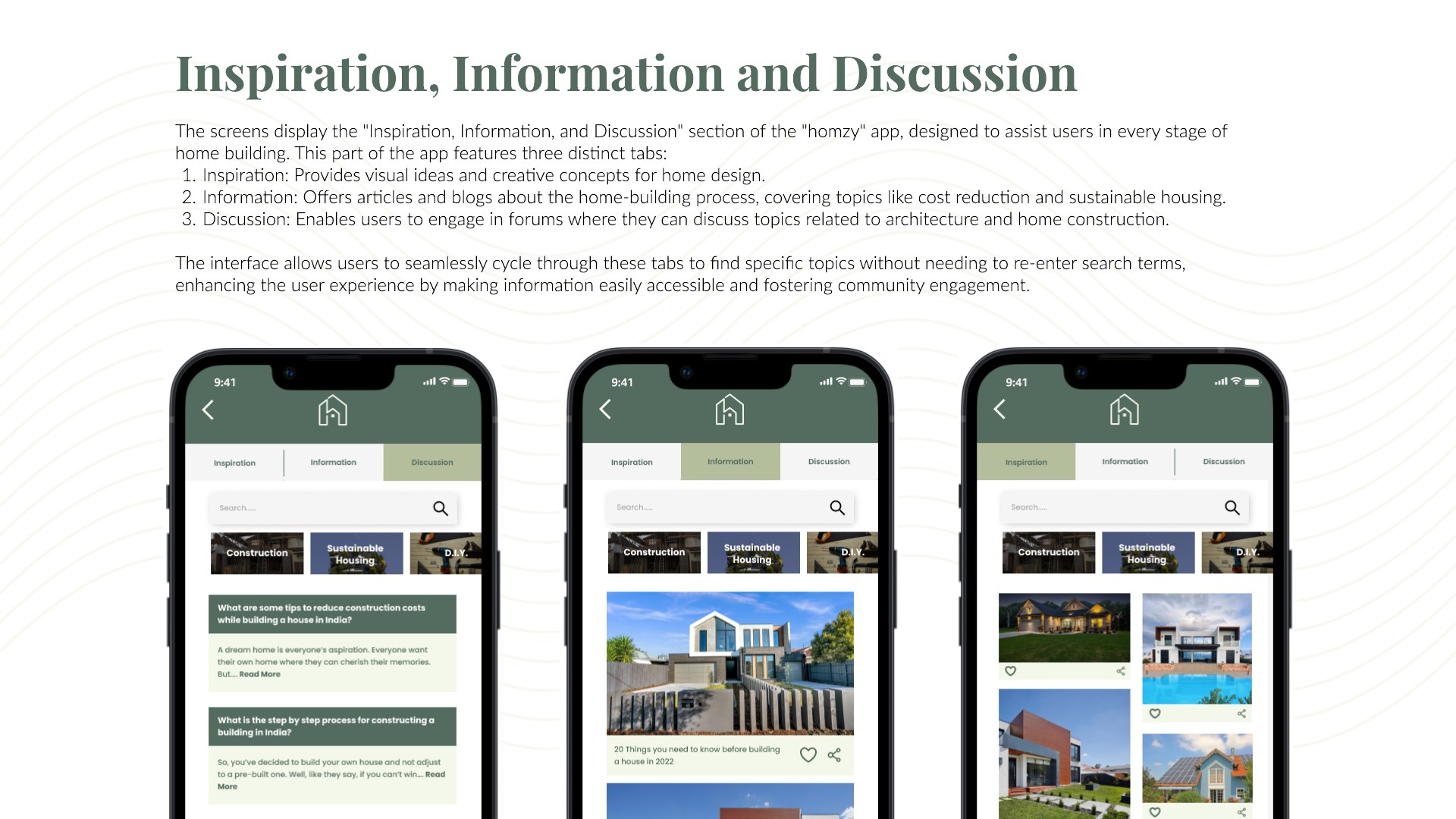
Inspiration & community
04
Craft: brand & system
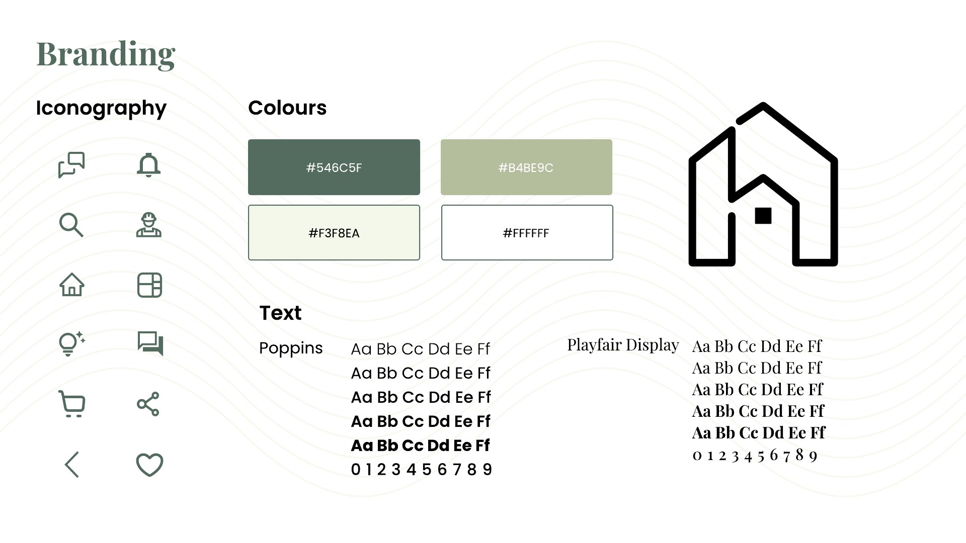
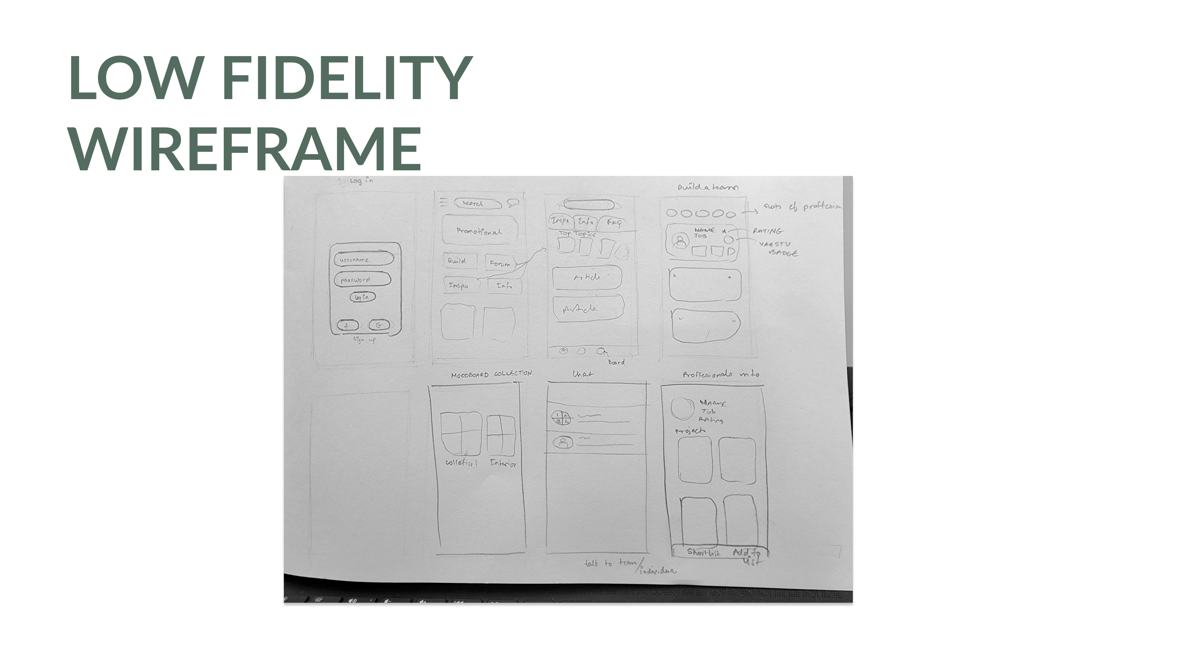
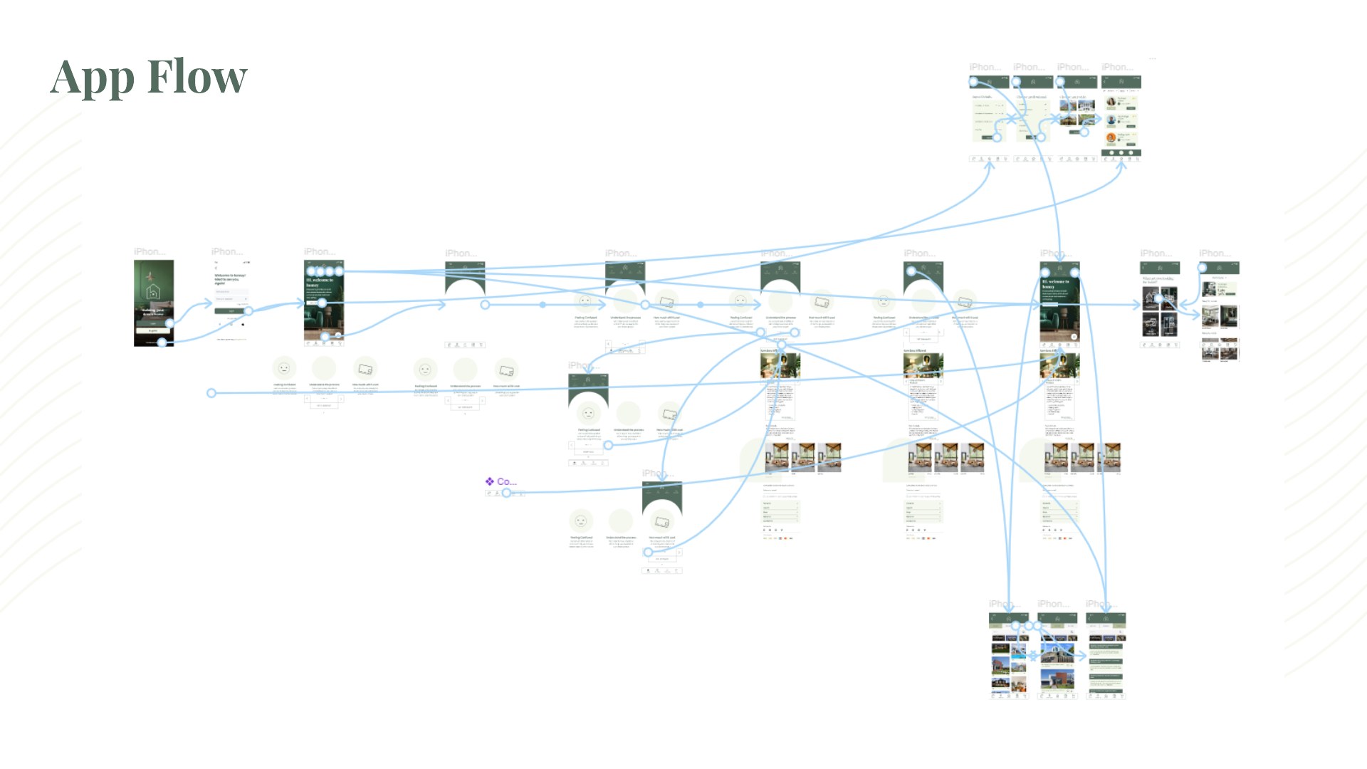
The brand pairs Playfair Display with Poppins on a deep, grounded green — home as growth and stability rather than a transaction. The full flow was mapped, wireframed and taken to hi-fi across login, home, professionals, store and community.
Brand system
Paper-first: low-fi sketches
The full app flow
05
Reflection
Homzy is a research-grounded 0→1 concept. If I continued it, I'd test the questionnaire's matching quality with real professionals, and design explicitly multi-user features — shared boards, decision votes, role-based views — because the research says the account holder is never deciding alone.
What it taught me: when the real unit of decision-making is a group, "user-centred" design has to widen its lens. The most important screen I designed wasn't a screen at all — it was the questionnaire logic that translated a family's messy, negotiated needs into something a marketplace could answer.